
Aspiro
Helping a new management consultancy find its place in the world.
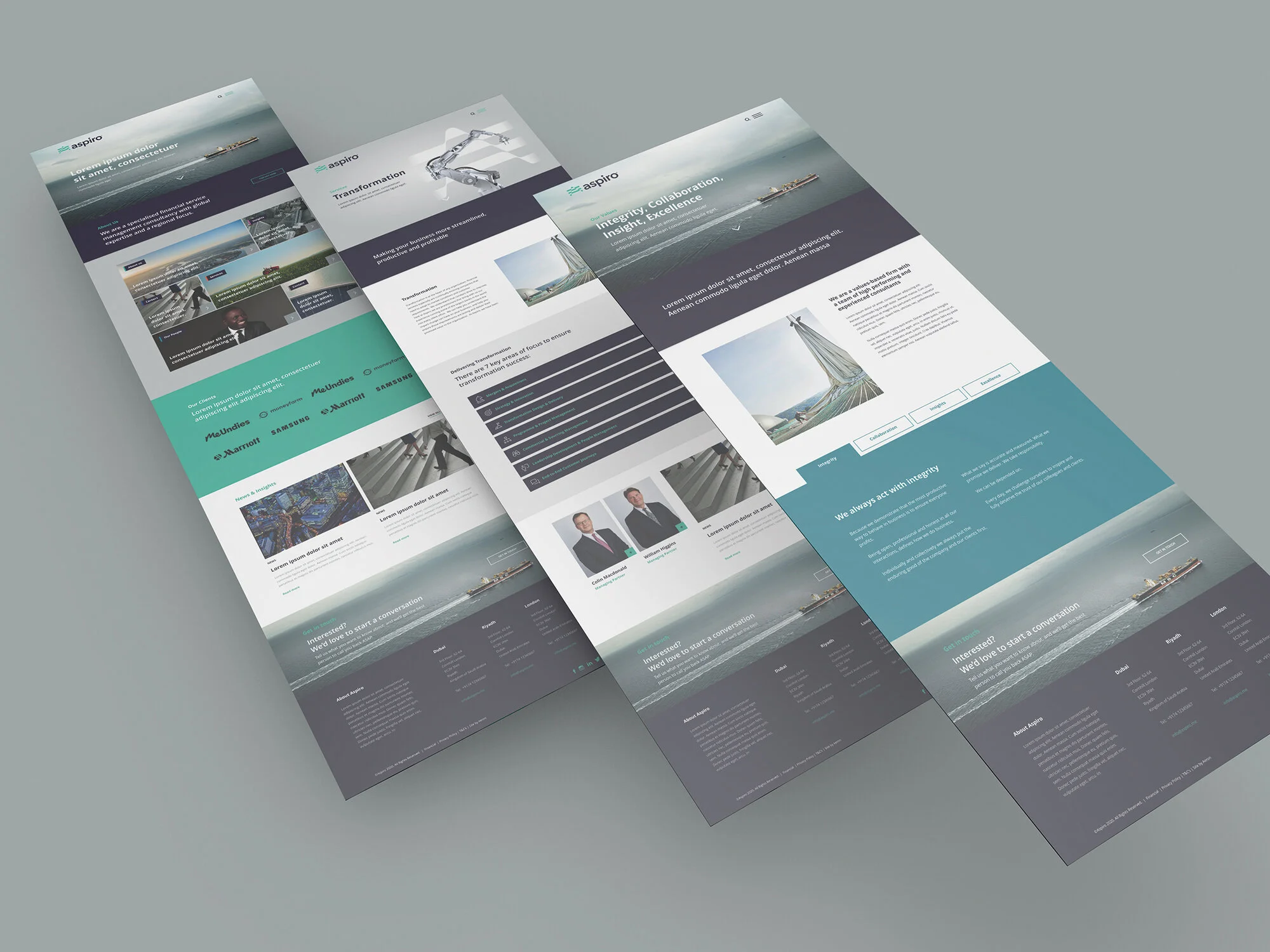
Aspiro is a business transformation management consultancy dedicated to the financial services industry. They help ambitious companies transform, grow and thrive in the regional and global marketplace by tackling their most challenging projects and building new capabilities.


Putting lasting results. First.
We were asked to develop a visual expression which represented a business positioning that was about co-creating value and empowering pioneers. This was summarised in the strapline Putting lasting results. First.
The symbol is a combination of an abstract ‘A”, upward arrow and a flag. It suggests co-creation coming together to produce positive results. The symbol can be used as a traditional sign-off as well as a ‘supergraphic’ device as a background to cut-out imagery. The logotype feels timeless, contemporary and professional.

The colour scheme of dark purple and bright turquoise work in conjunction with imagery that suggests innovation and global impact.
An extensive set of guidelines was produced to facilitate easy implementation by a small marketing team.


This work was carried out with Aeron Branding
Brand strategy / Visual expression / Visual design / UX/UI design / Art direction / Advertising / Brand film